|
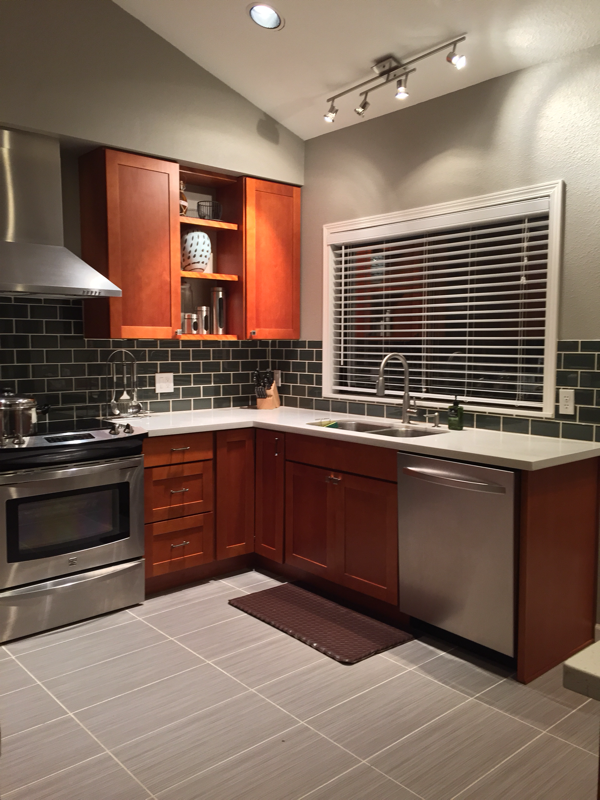
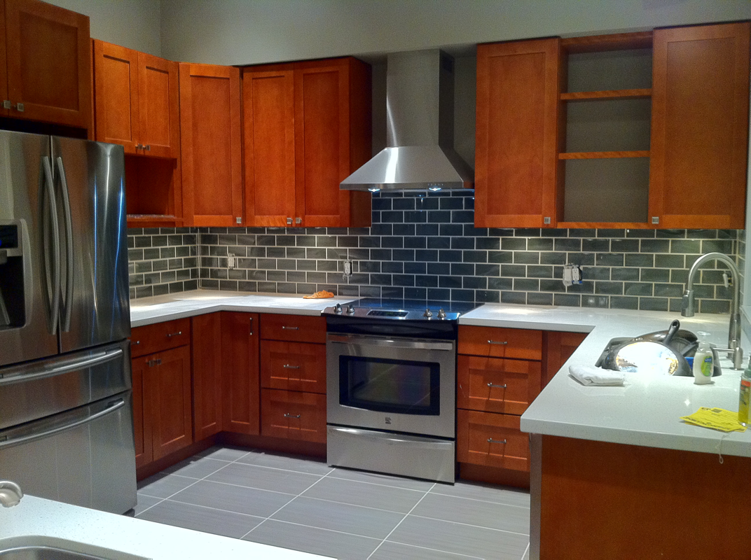
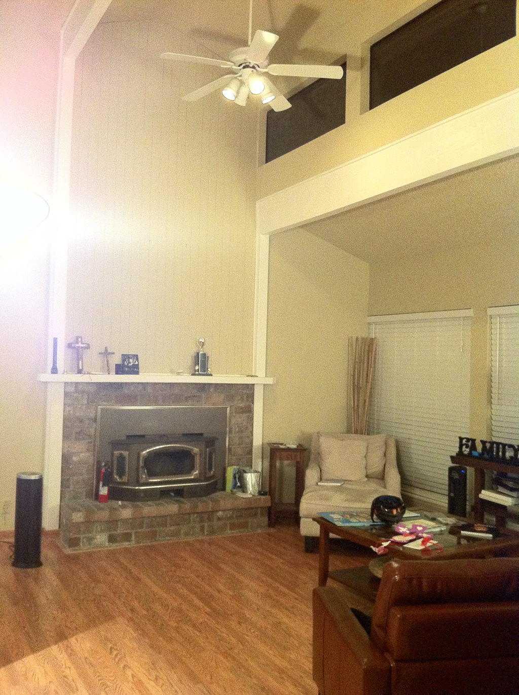
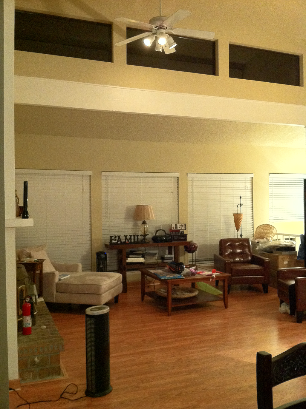
The kitchen in our 1979 split level was, hands down, the first space to renovate. It was dark, dated, and smelly. There was a musty odor emanating from the cabinets complete with cobwebs, rat droppings, and creepy-crawlies.; the tiny island wasn't locked down and would move every time we accidentally hit it; and the garbage disposal seemed to emit an old raw chicken smell every time we turned it on (BARF). I hated using the kitchen and honestly felt sick to my stomach every time I had to use it. So, it was time to start transforming our home into something fabulous! RENOVATION #1: KITCHEN Contractor: Brighten Construction Here is the BEFORE: 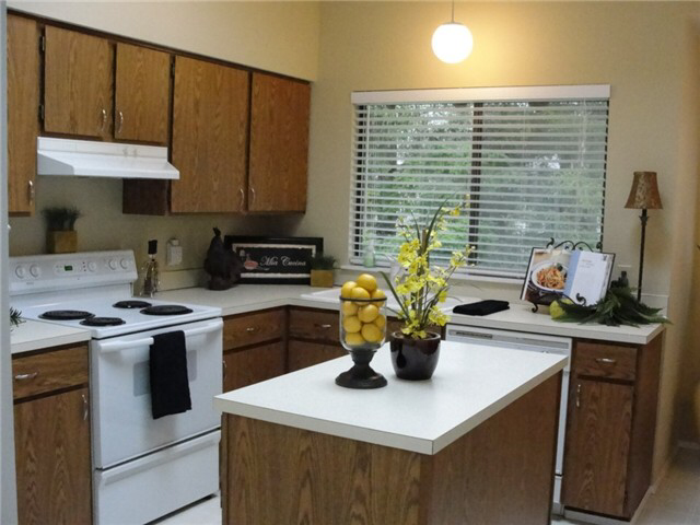 Now for the AFTER: We added moss green glass tile from Pental in a subway pattern on the walls, striated 12 x 24 ceramic tiles on the floor, white quartz counter-tops, stainless steel appliances, and light cherry cabinets. We opened up the kitchen into the dining room and created a more open flow so that entertaining guests wouldn't be so closed off. RENOVATION #2: HALLWAY BATH Contractor: Vu Construction We basically wanted to redo all the spaces that were more accessible to guests so that it was inviting. Growing up, I lived in a dark and dated home that most people thought was haunted (which, I swear, it was) and this home felt somewhat like that. Why subject our guests to that kind of environment, right? 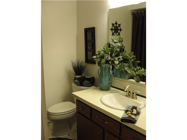 GUTTING OUT THE BATHROOM! 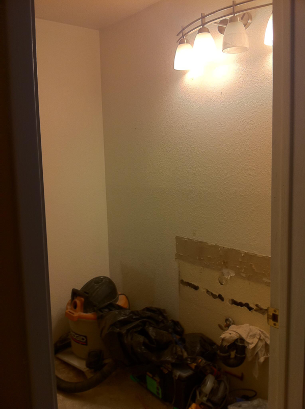 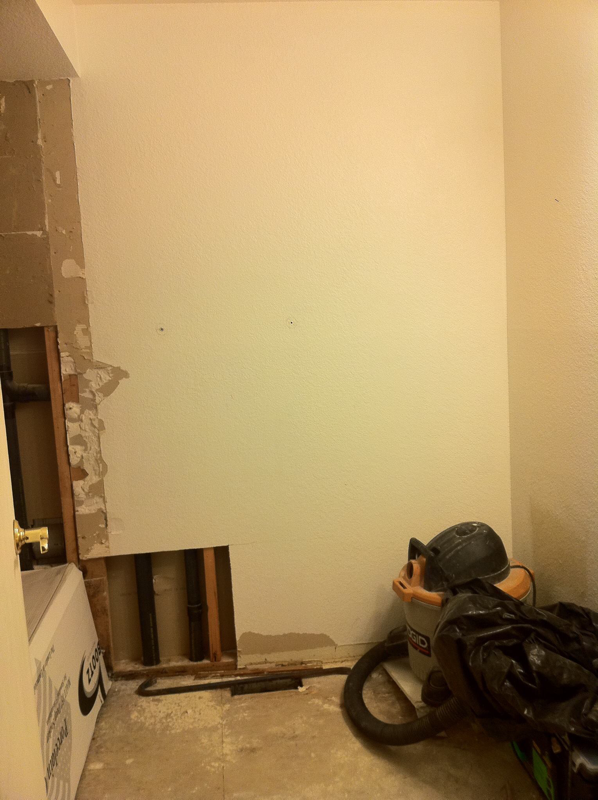 Rendering / Design Concept: 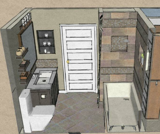 Any time we move forward with our renovations, I render designs on Google SketchUp (I'm self-taught, thank you very much!) My husband's a very visual person and he wants to see what our rooms could look like. Many times, our actual rooms won't look exactly like the renderings but that's okay! Like weddings, you don't always get things exactly how you first see them. Though, I'll say it's pretty darn close... All tile was picked up from Home Depot and lighting from Seattle Lighting. AFTER: 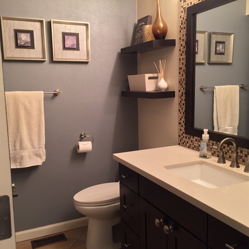 RENOVATION #3: LIVING/DINING Contractor: Underwood Revisions One thing that we loved about the living and dining areas were the big windows and high ceilings. It gave the place dimension and didn't feel like a "box"...our 1st home had very square spaces and seemed so "blah" that we appreciate any kind of interior detail that gives a home personality. We saw a lot of potential here. The layout in each room stayed the same but we updated some of the finishes - we installed hand-scraped hardwoods, white 4" base trim, refinished the walls into a light orange peel finish, new wall paint, replaced the old wobbly ceiling fan, added recessed lights and re-faced the fireplace.
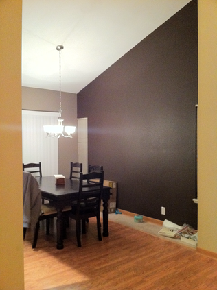 And the magic begins... 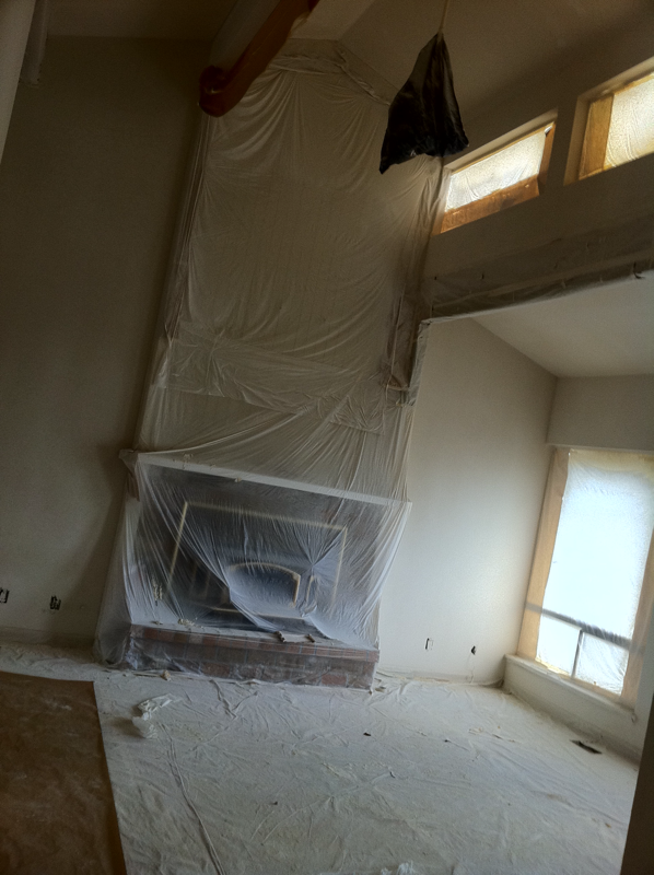 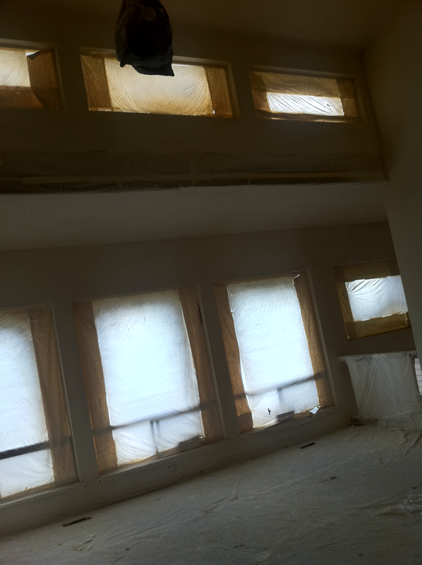 Rendering / Design Concept: 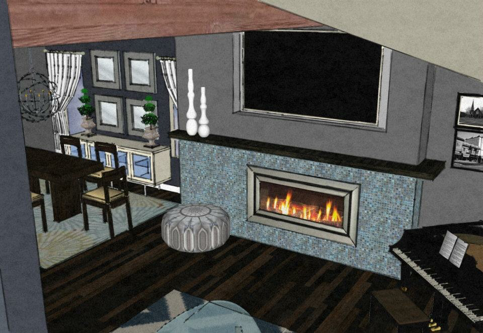 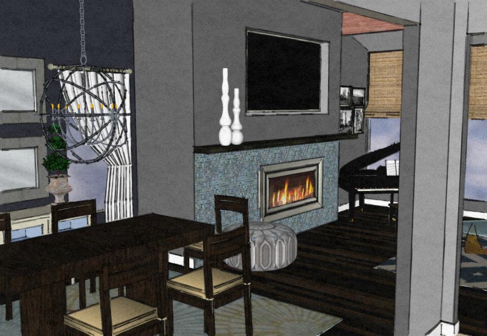 Our finished space isn't exact to the drawings due to each of the following: budget, structure, or simply changing our minds. Again, pretty damn close! AFTER: 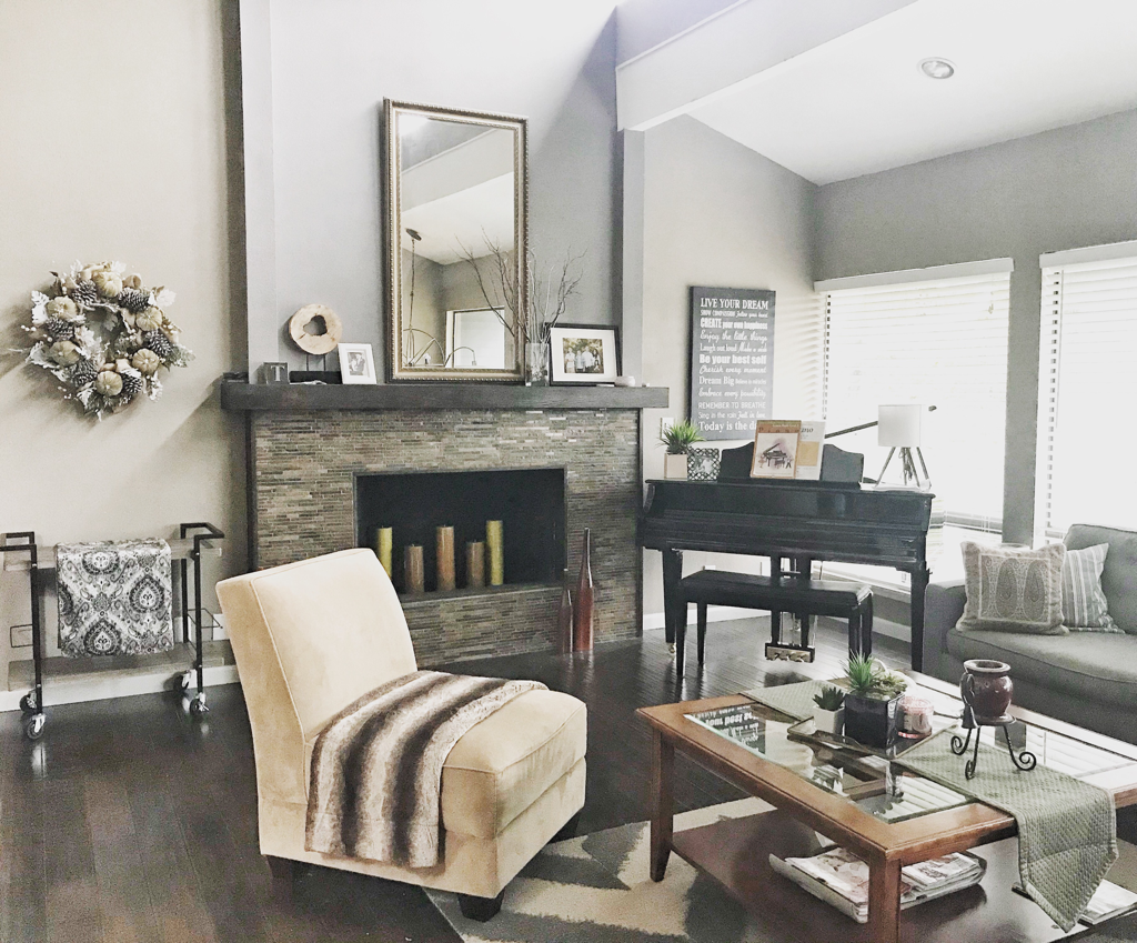 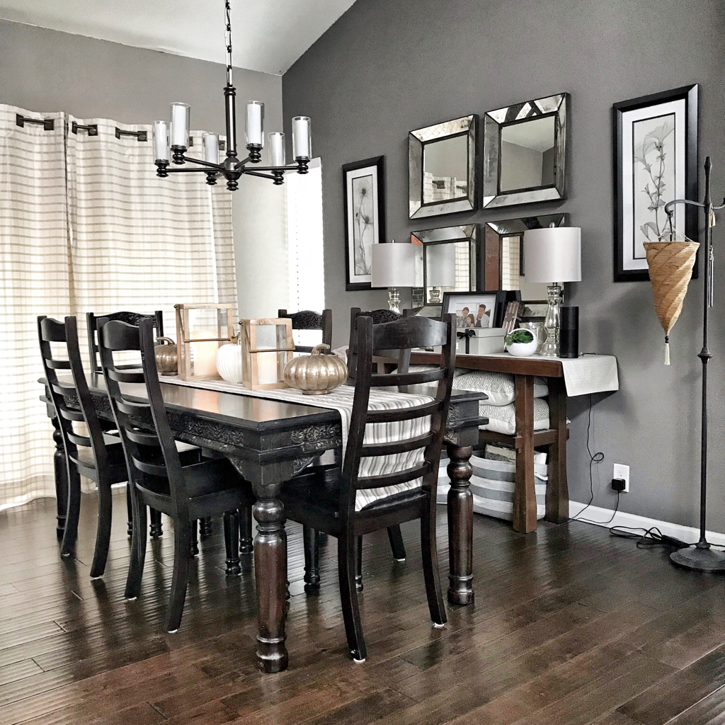 The wall colors in the photo below looks a lot darker than in reality. It's actually the same gray color as the dining room and the accent wall to the right (with gallery picture wall) is a slate-blue color. 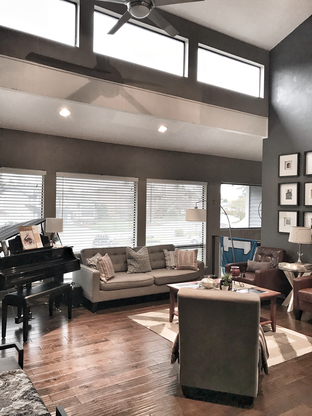 RENOVATION #4: ENTRY/STAIRS Contractor: Underwood Revisions The landing and stairway area didn't look too bad but it seemed plain compared to the rest of the reno. I had this vision in my mind to mix materials on the stairs (mosaic tile on the risers and hardwood on the treads). BEFORE: The finished entry in its updated form... The chandelier was the finishing touch in the space and was (originally) supposed to be in the dining room. But I wanted to add a conversational piece and oomph to the entryway to pique people's interest. It totally works for the space. Slate tile and mosaics are from Home Depot. I gotta tell you seeing my thoughts come into fruition makes all the mess and stress worth it! Would you agree? AFTER: 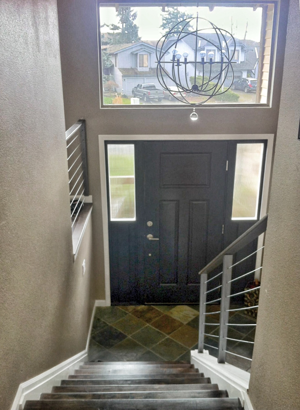 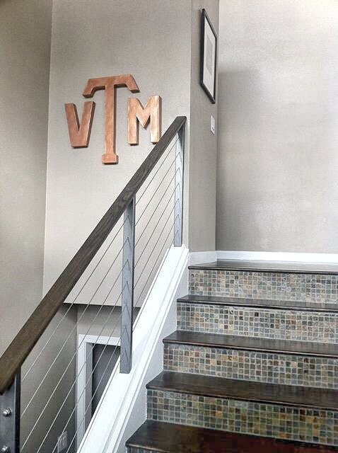 Alas, comes the end of Phase I of our upstairs reno. Coming soon is Mi Casa Renovations - UPSTAIRS (PART 2 of 2: Bedrooms and Master Bath). ~XOXO, Mari Entryway Chandelier from Ballard Designs www.ballarddesigns.com/
Counter-tops & cabinetry from Evergreen Granite in Kent, WA www.evergreengranite.com/ Kitchen tile (flooring and wall tile) purchased from Pental www.pentalonline.com/ Hardwood flooring purchased from DeMar in Tukwila, WA www.demarfloor.com/
2 Comments
Anna
1/19/2018 07:23:43 am
From drab to fab! You transferred your house into your home. Everything looks Beautiful!!
Mari
1/19/2018 07:06:24 pm
Thank you so much! A very long and stressful process, but worth it! Leave a Reply. |

Meet MariWelcome to my blog where I share my inner thoughts on life and all things I love - beauty, home decor and design, amazing food, our family travels, and fashion! Archives
March 2021
|
 RSS Feed
|
|

|